Documentation
Everything you need to add scroll motion to your site
Scroll Studio pairs a from-scratch 26.6 kb motion engine with a visual studio and native tagging for every major builder. This guide takes you from a first animation in five minutes to the full parameter reference and per-builder workflow.
Quick start
Your first scroll animation, in six steps.
- 1
Install & activate the plugin
Free from WordPress.org, or the Pro
.zipfrom your licence page or the link in your licence email. Then open Scroll Studio → Settings and tick the builder you use. - 2
Open the Studio
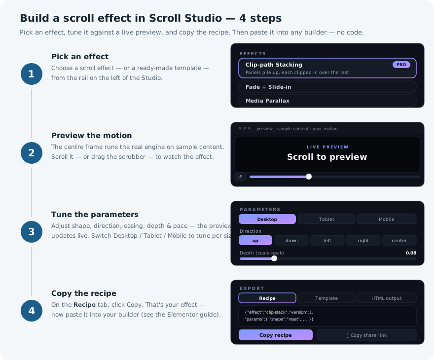
Go to Scroll Studio → Editor. The three-pane studio loads right inside wp-admin: effect picker on the left, live preview in the middle, parameters on the right.
- 3
Pick a template
Start from a template in the left-hand list — a ready-made set of panels, already set up and ready to animate. You can rewrite the words and swap the images later. It simply gives the preview something real to move.
- 4
Pick an effect & tune it
Choose an effect below the templates, then drag the sliders while the preview scrubs. When it looks right, you are done designing.
- 5
Copy the result
Click Copy. You get either the recipe — one short line of text that describes the movement you just designed — or a ready-to-paste embed if you want the example panels too. The recipe describes movement only, never your words or pictures.
- 6
Put it on your page
In your page builder, either drop in a Scroll Studio template, or take a section you have already built, label its parts, and paste the recipe onto it. Then view your live page — it animates as you scroll.
Install & activate
Free
From WordPress.org
The Studio, the full animation engine, two effects (Fade + Slide-in and Media Parallax), the labelling controls in every page builder, code export, and the Minimal template. It updates itself from your WordPress dashboard like any other free plugin.
Pro
From your licence email
Open the download link in your licence email — or paste your key into your licence page, which always has the current build — then in WordPress go to Plugins → Add New → Upload and choose it. You get the six premium effects (Clip-path Stacking, Pinned Horizontal Scroll, Text Stagger, SVG Line Draw, Shape Mask Reveal, SVG Shape Mask), every template, automatic updates — and every new effect and template we add later, at no extra cost. Pro takes the place of the free version, and your settings come with it.
Once it is switched on, open Scroll Studio → Settings. Scroll Studio looks for the page builders you already have and ticks them for you. A builder is only used when it is both ticked here and installed on the site.
Activate your licence
Pro features unlock the moment your licence is validated:
- Buy a licence at checkout — you receive a key by email.
- In wp-admin, go to Scroll Studio → Settings → Licence.
- Paste the key and click Activate. Pro switches on straight away.
- A Single-site licence covers one website. Unlimited covers as many as you like.
- Moving a single-site licence to a different website? Click Deactivate on the old one first to free it up, then activate on the new one.
- Lost your key? The licence page re-sends it to the address you bought with, and once you have the key that same page holds your download and your activated sites.
- If a licence expires, everything already on your site keeps working exactly as it is — your animations do not stop. You simply stop receiving updates and new templates until you renew.
How it works
There are three parts, and they stay separate:
You design an effect in the Studio by dragging sliders until it looks right. The Studio hands you a recipe — one short line of text that captures those settings. You paste that recipe onto a section of your page and label the parts inside it, so Scroll Studio knows which pieces are meant to move. When a visitor loads the page, it does the rest.
There are two ways to get something to animate. You can drop in a template, which arrives ready-made with example panels you then rewrite in your own words. Or you can take a section you have already built and label it. Either way the recipe holds only the movement: templates come with content, recipes never do. You keep customizing your text and images in your favorite editor, exactly as you edit anything else.
Nothing is permanent. Every effect puts everything back the way it was if you remove it, so nothing gets baked into your page.
What a recipe looks like
You never have to read this. The Studio writes it, you copy it, you paste it. This section is here only if you are curious what you just pasted — or if you would rather type a value by hand than drag a slider.
A recipe names an effect and lists the settings you chose. That is the whole thing:
{
  "effect": "clip-stack",
  "version": 1,
  "params": {
    "shape": "inset",
    "direction": "up",
    "easing": "ease-in-out-cubic",
    "depth": 0.08,
    "dim": 0.35,
    "lift": 0.2,
    "pace": 1
  }
}effect— which effect to use.version— so your recipes keep working in future releases. The Studio fills this in.params— the settings you chose. Leave any of them out and Scroll Studio uses its normal default.breakpoints— optional, Pro only. Different settings for phones and tablets. See Different settings per screen size below.
Notice there is no text or images in there. That is the point — a recipe is safe to reuse on any page, and it can never overwrite your content.
Labelling the three parts
Scroll Studio needs to know which parts of your section do what. Every effect uses the same three labels, and you only set them once. Think of it as a stage:
Recipe hostThe outer section — the whole area the effect happens in. This is where you paste the recipe.
ViewportThe stage inside it — the window your panels perform in. For effects that hold still on screen, this is the part that stays put.
PanelEach slide — the individual pieces that stack, fade, drift or slide past, in the order you put them.
In a page builder you pick these from a dropdown menu. You never type anything. Choosing Panel from a menu is the entire job, and Scroll Studio handles the technical side invisibly.
Scroll Studio adds that dropdown itself, so it appears in Elementor whichever edition you run. And if you use a template, the labels are already set — there is nothing to do at all.
What this looks like in code (only if you’re curious)
<section data-ss-recipe='{"effect":"clip-stack","version":1,"params":{"shape":"inset","pace":1}}'>
  <div data-ss-viewport>
    <div data-ss-panel> …your first panel…  </div>
    <div data-ss-panel> …your second panel… </div>
    <div data-ss-panel> …your third panel…  </div>
  </div>
</section>
This is what your page builder quietly produces when you pick those three roles from the dropdown. If you build websites by hand, you can write it yourself — see Raw HTML & any builder.
Different settings per screen size
ProEvery effect already adapts itself to the size of the screen, so your animation works on phones without you doing anything. This feature goes one step further: it lets you deliberately change the settings on smaller screens — a gentler slide on phones, a quicker pace on tablets — without building the section twice.
In the Studio, use the Desktop / Tablet / Mobile buttons above the preview. Desktop is your main design. Switch to Tablet or Mobile and adjust any slider, and that new value is remembered for that size only. The preview resizes to match, so you are looking at what visitors on that device will actually see.
- Desktop is your starting point — the settings everything else builds on.
- Tablet takes over on screens up to about 1024 px wide.
- Mobile takes over on screens up to about 768 px wide, and it also inherits anything you changed for tablet. So a change you make on tablet carries down to mobile unless you change it again there.
Only the sliders you actually move are saved. Everything else keeps following your desktop design, so there is no risk of quietly locking in a value you never chose.
What this looks like in the recipe (only if you’re curious)
{
  "effect": "clip-stack",
  "version": 1,
  "params": { "shape": "inset", "pace": 1, "dim": 0.35 },
  "breakpoints": {
    "tablet": { "pace": 0.9 },
    "mobile": { "pace": 0.8, "dim": 0.2 }
  }
}
Saved looks
ProOnce you have an effect looking the way you want, save it as a look and use it again anywhere. A look remembers the movement — the effect, the panel count and every setting, including any you changed for phones and tablets. It never contains your words or images.
- Get an effect looking right, then open the Saved looks panel on the right and click Save. Give it a name.
- Apply a saved look any time to bring back that exact movement, then keep adjusting from there.
- Rename or delete your looks from the same panel.
Looks are saved in your browser, so your collection stays on the computer you design on.
The panel also includes a few starter looks that come with the plugin — Portfolio card stack, for example, which sets up Clip-path Stacking as a framed stack of cards. Apply one and adjust it however you like. The starters themselves can’t be renamed or deleted, so you can always get back to them; save your version and it becomes a look of your own.
Effect reference
Eight effects are available today. You design them all with sliders in the Studio — the tables below just spell out what each slider does.
Effects come in two kinds, which changes how the section behaves as you scroll past it:
- Pinned — the section stops and holds still on screen while the panels move within it. You keep scrolling normally; the page pauses in place until the sequence finishes. Used by Clip-path Stacking and Pinned Horizontal Scroll.
- Flow — nothing holds still. Panels simply animate as they pass by, and the page scrolls the way it always does. Used by everything else, and the safer choice if you are unsure.
Free vs Pro: two effects are free — Fade + Slide-in and Media Parallax. The six showpieces — Clip-path Stacking, Pinned Horizontal Scroll, Text Stagger, SVG Line Draw, Shape Mask Reveal and SVG Shape Mask — are Pro. Each effect below is tagged accordingly.
Clip-path Stacking
ProPinnedclip-stackPanels stack up like a deck of cards as you scroll. Each new panel arrives over the one before it, and the covered panel eases backwards so the stack feels deep. This is the signature effect.
| Setting | Range | Starts at | What it does |
|---|---|---|---|
shape | inset · circle | inset | The shape the arriving panel comes in through — a straight edge sweeping across (inset), or a circle opening outward (circle). |
direction | up · down · left · right · center | up | Which edge the straight-edged sweep travels from. Has no effect if you chose the circle. |
easing | see Easing curves | ease-in-out-cubic | How the motion speeds up and slows down. |
depth | 0 – 0.2 | 0.08 | How far a covered panel shrinks back. This is what makes the stack look three-dimensional. |
dim | 0 – 0.6 | 0.35 | How much a covered panel darkens as it gets buried. |
lift | 0 – 0.6 | 0.2 | How strong the soft shadow is along the moving edge of the arriving panel. Only applies to the straight-edged shape. |
pace | 0.6 – 2 × screen height | 1 | How much scrolling it takes to advance one panel. Higher means the stack moves more slowly. |
stageH | 40 – 100 % of screen | 100 | How tall the stage is. At 100 it fills the whole screen; below 100 it becomes a centred frame with your page visible around it, and the panels read as a stack of cards — see Framed mode below. |
stageH below 100 and the stage shrinks to a centred frame, with your page still visible around it. Two things change. A panel easing backwards now looks like it is receding into a frame, rather than like the whole page zooming out. And any shadow you have put on a panel yourself will now actually show up — it appears in the gap that opens as the panel shrinks. For this look, turn depth up and lift down: a framed card relies on its shadow, while a full-screen panel relies on the bright edge along its moving side. The Portfolio Reveal template and the Portfolio card stack starter look are both set up this way already.Fade + Slide-in
FreeFlowrevealEach panel fades in, slides up and grows a little as it scrolls into view. Nothing sticks to the screen — your panels stay in the normal flow of the page.
| Setting | Range | Starts at | What it does |
|---|---|---|---|
direction | up · down · left · right · center · none | up | Which way the panel comes in from. Choose center for a zoom with no slide, or none for a plain fade. |
distance | 0 – 160 px | 48 | How far the panel slides in. |
zoom | 0 – 0.4 | 0.12 | How much the panel grows as it settles into place. |
easing | see Easing curves | ease-out-cubic | How the slide and the zoom speed up and slow down. The fade itself is always steady. |
finish | 0.2 – 0.7 × screen height | 0.5 | How far up the screen the panel is when it finishes arriving — 0.5 is the middle. Keep it a little above the middle so the motion is still visible as the panel comes to rest. |
length | 0.2 – 1.6 × screen height | 0.6 | How much scrolling the fade is spread over. Higher is slower. Keep it under the height of one panel if you want strictly one panel arriving at a time. |
once | on · off | off | Leave the panel in place once it has appeared, instead of animating it back out when you scroll up. |
Media Parallax
FreeFlowparallaxImages drift at their own speed as the panel goes by, so they feel like they sit at a different distance than the text. Each image is enlarged slightly and cropped to its frame, so you never see an edge slide into view. If a panel has no image, its text drifts gently instead.
| Setting | Range | Starts at | What it does |
|---|---|---|---|
axis | vertical · horizontal | vertical | Whether the image drifts up and down, or side to side. |
speed | 0 – 1 | 0.5 | How much the image drifts. |
zoom | 1 – 1.4 × | 1.2 | How much the image is enlarged so its edges never come into view while it drifts. Raised automatically if you choose a high speed. |
invert | on · off | off | Drift the opposite way. |
Pinned Horizontal Scroll
ProPinnedpin-horizontalThe section holds still on screen while your ordinary downward scrolling slides a row of panels sideways. Visitors scroll the way they always do; the movement they see is horizontal.
| Setting | Range | Starts at | What it does |
|---|---|---|---|
panelWidth | 30 – 100 % of screen | 72 | How wide each panel is, measured against the width of the screen. |
gap | 0 – 80 px | 0 | The space between panels. |
easing | see Easing curves | linear | How the sideways motion speeds up and slows down. Linear follows your scrolling exactly. |
pace | 0.6 – 2 × | 1 | How much scrolling it takes to travel sideways. Higher means the row moves more slowly. |
Text Stagger
ProFlowtext-staggerHeadlines arrive one word — or one letter — at a time, each following just behind the last. Line breaks, links and bold or italic text all survive intact, and your original text is restored exactly if you remove the effect. Headings are included automatically; to add a paragraph of body copy, tag it as described below.
| Setting | Range | Starts at | What it does |
|---|---|---|---|
unit | word · char | word | Bring the text in a word at a time, or a letter at a time. |
direction | up · down · left · right · none | up | Which way each word or letter comes in from. |
distance | 0 – 80 px | 32 | How far each word or letter slides in. |
stagger | 0 – 0.95 | 0.6 | How much each word waits for the one before it. 0 brings them all in together; higher makes it a clear one-after-another ripple. |
easing | see Easing curves | ease-out-cubic | How each word or letter speeds up and slows down as it slides. |
finish | 0.2 – 0.7 × screen height | 0.4 | How far up the screen the text is when the last word lands. Keep it a little above the middle so the ripple is still running while the text is being read. |
length | 0.2 – 1.8 × screen height | 0.6 | How much scrolling the ripple is spread over. Higher is slower. |
once | on · off | off | Leave the text in place once it has appeared, instead of animating it back out when you scroll up. |
SVG Line Draw
ProFlowsvg-drawA line drawing inside a panel draws itself on as the panel scrolls into view, as though an invisible pen were tracing it. Put a vector graphic (an SVG — the kind of image a designer exports for logos and icons) into your panel and each of its lines is traced on in turn. Shapes that are filled in but have no outline are skipped, since there is no line to draw.
| Setting | Range | Starts at | What it does |
|---|---|---|---|
from | start · end | start | Which end of the line the drawing starts from. |
order | sequential · together | sequential | Draw the lines one after another, or all at the same time. |
stagger | 0 – 0.95 | 0.5 | How much each line waits for the one before it. Only applies when the lines are drawn one after another. |
easing | see Easing curves | ease-in-out-cubic | How the drawing speeds up and slows down. |
finish | 0.2 – 0.7 × screen height | 0.5 | How far up the screen the panel is when the drawing completes — 0.5 is the middle. |
length | 0.2 – 1.6 × screen height | 0.7 | How much scrolling the drawing is spread over. Higher is slower. |
once | on · off | off | Leave the drawing finished once it is complete, instead of un-drawing it when you scroll up. |
Shape Mask Reveal
ProFlowmask-revealEach panel appears through a growing shape as it scrolls into view — a circle opening outward, a rectangle expanding, or a hard edge sweeping across. It works with whatever is already in your panel; there is nothing special to add.
| Setting | Range | Starts at | What it does |
|---|---|---|---|
shape | circle · inset · wipe | circle | A circle opening outward, a rectangle expanding, or a hard edge sweeping across. |
direction | center · up · down · left · right | center | Where the shape opens from. For the sweeping edge, this is the side it starts at. |
feather | 0 – 0.6 | 0 | How soft the shape’s edge is. 0 gives a crisp edge; higher blurs it. |
easing | see Easing curves | ease-out-cubic | How the shape speeds up and slows down as it grows. |
finish | 0.2 – 0.7 × screen height | 0.5 | How far up the screen the panel is when it is fully revealed — 0.5 is the middle. |
length | 0.2 – 1.6 × screen height | 0.6 | How much scrolling the reveal is spread over. Higher is slower. |
once | on · off | off | Leave the panel visible once it has appeared, instead of covering it again when you scroll up. |
SVG Shape Mask
ProFlowsvg-maskEach panel opens up through a shape that grows from a single point until it fills the screen — a blob, star, hexagon, heart, diamond or burst, or a shape of your own such as a logo. It is the decorative cousin of Shape Mask Reveal: that one uses plain circles and rectangles, this one reveals through a real outline. If you want your own shape and are not sure how to supply it, any web developer can add it for you in a minute.
| Setting | Range | Starts at | What it does |
|---|---|---|---|
shape | blob · star · hexagon · heart · diamond · burst · custom | blob | The shape the panel is revealed through. Choose custom to use a shape of your own. |
direction | center · up · down · left · right | center | The point the shape grows out from. |
feather | 0 – 0.6 | 0 | How soft the shape’s edge is. 0 gives a crisp edge; higher blurs it. |
easing | see Easing curves | ease-out-cubic | How the shape speeds up and slows down as it grows. |
finish | 0.2 – 0.7 × screen height | 0.5 | How far up the screen the panel is when it is fully revealed — 0.5 is the middle. |
length | 0.2 – 1.6 × screen height | 0.6 | How much scrolling the reveal is spread over. Higher is slower. |
once | on · off | off | Leave the panel visible once it has appeared, instead of covering it again when you scroll up. |
Easing curves
Easing is how a movement speeds up and slows down. Real things don’t start and stop instantly, and motion that does looks mechanical. Every effect has an easing setting, and these are the choices:
linearease-inease-outease-in-outease-out-cubicease-in-out-cubicease-out-quartease-out-expoease-in-out-expoease-out-back- linear — a constant speed, no acceleration. Right for anything that should follow your scrolling exactly.
- ease-out… — starts fast, settles gently. The most natural choice for something arriving on screen, and the default for most effects.
- ease-in… — starts gently, finishes fast. Better for something leaving.
- ease-in-out… — gentle at both ends. Good for longer movements like the panel stack.
- ease-out-back — overshoots slightly and springs back. Playful; use it sparingly.
The suffixes (cubic, quart, expo) are simply degrees of the same idea — expo is the most dramatic, cubic the most restrained. The quickest way to choose is to try one and watch the preview.
Elementor
Fully supported and tested. Before the steps, the two things people most often expect and don’t find:
A · Insert a template (nothing to label)
Scroll Studio adds its templates to Elementor’s own template library. In the editor, click the folder icon → Add Template → My Templates, pick a Scroll Studio template and insert it. It arrives as ordinary Elementor containers you can edit normally, with everything already set up — just replace the words and images. Minimal is free; the rest need Pro.
B · Label a section you built yourself
You will build three containers nested inside one another, and tell Scroll Studio what each one is. Five steps, matching the diagram below:
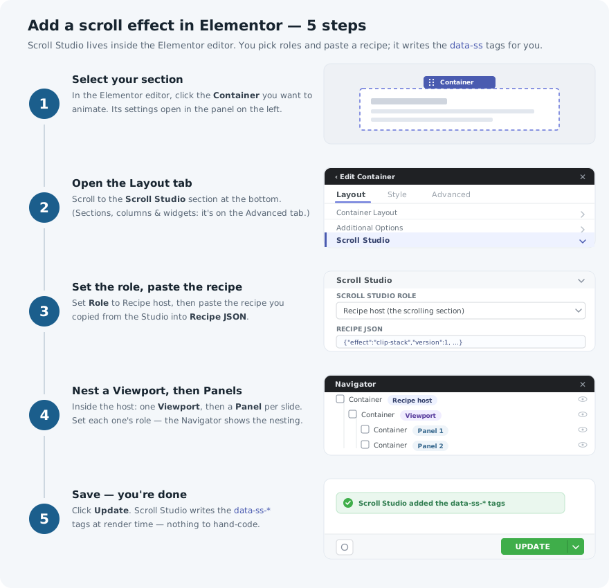
- Select the container. Click it, or its dotted handle. The settings panel opens on the left with a row of tabs across the top — that row only appears once something is selected.
- Open the Layout tab and find “Scroll Studio”. For a Container, scroll to the bottom of the Layout tab and you will see a Scroll Studio heading. (On an older Section, Column or widget, look on the Advanced tab instead.) Click the heading to open it.
- On the outer container, choose the role and paste the recipe. Set Scroll Studio role to Recipe host (the scrolling section). A Recipe JSON box appears — paste your recipe in.
- Add the Viewport, then your Panels. Inside the outer container add one more container and set it to Viewport (the pinned stage). Inside that, add one container per slide, each set to Panel (a slide / step), and put your normal headings and images inside the panels. Leave Fix pinning ancestors switched on.
- Save. Click Update and view the page. You will not see the animation inside the Elementor editor — that is deliberate, so it never interferes while you are editing. View the live page to watch it.
Where the recipe comes from: design your effect in the Studio and click Copy recipe. You get one line like {"effect":"clip-stack","version":1,"params":{ … }}. That whole line is what goes into the Recipe JSON box at step 3.
The Scroll Studio role dropdown at each of the three levels from steps 3 and 4 — real screenshots, click to zoom in:
Gutenberg (block editor)
Fully supported and tested — this is the editor built into WordPress, so you don’t need a page builder at all. Two ways in:
A · Insert a pattern
Click the + to add a block, go to the Patterns tab and choose the Scroll Studio category. Pick one and it drops straight into your page, fully set up, using ordinary WordPress blocks you can edit as normal. Replace the words and images and you’re done.
If you want to change the effect itself, or the structure, rather than just the words: open List View (the icon next to the + at the top left), click the three dots beside the pattern’s name and choose Detach. The pattern becomes ordinary blocks you can label yourself, exactly as in part B below.
Finding the pattern, and detaching it afterwards — real screenshots, click to zoom in:
B · Label blocks you built yourself
Same idea as Elementor — nothing to type. Select a Group, Columns, Column or Cover block, open the settings sidebar with the gear icon, and find the Scroll Studio panel:
- On the outer Group, set Scroll Studio role to Recipe host (the scrolling section) and paste your recipe into the Recipe JSON box.
- On the Group inside it, set the role to Viewport (the pinned stage).
- On each Group inside that, set the role to Panel (a slide / step).
- Leave Fix pinning ancestors switched on.
The Scroll Studio role dropdown at each of the three levels — real screenshots, click to zoom in:
These labels are stored safely alongside your content rather than inside it, so they can’t damage your blocks or trigger the “this block contains unexpected content” warning WordPress sometimes shows.
Bricks Untested
Bricks needs nothing special from us. It can already put labels on any element you build, and those labels are exactly what Scroll Studio looks for — so you build your section in Bricks the normal way and add three labels to it. Everything below uses Bricks’ own controls.
About the tag above: these steps follow directly from how both products work, and we will drop the tag as soon as we have run them on a Bricks site ourselves. Preview on a test page first, and tell us how it goes.
- Build the section as you normally would: an outer Section, a Container inside it, and one block inside that for each slide.
- Select the outer Section. Open Style → Attributes and add an attribute named
data-ss-recipe, with the recipe you copied from the Studio as its value. - Select the Container inside it and add an attribute named
data-ss-viewport. The value can be anything —1is fine. - Select each slide block and add an attribute named
data-ss-panel, again with any value. - For the effects that hold a section still while you scroll, also add
data-ss-unblockto the outer Section. This lets us undo anything in your theme that would stop the section holding still. - Save, then view the page.
WPBakery
Two ways to use Scroll Studio with WPBakery. Method B works on every WPBakery site, including tightly locked-down ones — use it if Method A gives you any trouble.
A · Using WPBakery’s own Row & Column settings Beta
In WPBakery the settings live on Row and Column elements, so you tag your section with WPBakery’s own controls and keep editing it visually. This method is the newest of the four, so preview it on a test page first — Method B below is there whenever you want a guaranteed result.
- Enable WPBakery under Scroll Studio → Settings (it flips to “detected” once js_composer is active).
- Edit a Row → open its settings → find the Scroll Studio fields. Set Scroll Studio role to Recipe host and paste the recipe into Recipe JSON.
- Set the inner Column to Viewport, and each inner Row to Panel.
- Turn Fix pinning ancestors on for pinned effects.
Templates also show up in WPBakery’s own Templates panel — Minimal on the free version, all of them with Pro.
B · Using a Raw HTML element
The dependable method, and the one to use if you can’t change plugin settings on the site. Here you paste a ready-made block of code into a Raw HTML element, which WPBakery passes through untouched.
Worth knowing before you choose this: content added this way is edited as code, not with WPBakery’s visual controls. Changing the wording later means editing the text between the tags rather than clicking on it. If you want to keep editing visually, use Method A.
- Add a Raw HTML element to the page (Add Element → search for “Raw HTML”).
- Paste in the example below, or use the embed export from the Studio, which gives you the same thing built around your own design.
- Replace “One”, “Two” and “Three” with your own headings, and change the colours if you like.
- Save the page and view it.
<!-- Paste into a WPBakery "Raw HTML" element. -->
<style>
  /* the engine positions the panels; backgrounds and type are yours */
  .my-panel { display:grid; place-content:center; text-align:center; padding:6vh 8vw; }
  .my-panel h2 { font-size:clamp(2rem,6vw,4rem); }
  .my-p0 { background:#0a0e1c; color:#f4f6fb; }
  .my-p1 { background:#c9316e; color:#fff8f3; }
  .my-p2 { background:#1a9e8f; color:#f0fffb; }
</style>

<section data-ss-recipe='{"effect":"clip-stack","version":1,"params":{"direction":"up","depth":0.12}}'>
  <div data-ss-viewport>
    <article data-ss-panel class="my-panel my-p0"><h2>One</h2></article>
    <article data-ss-panel class="my-panel my-p1"><h2>Two</h2></article>
    <article data-ss-panel class="my-panel my-p2"><h2>Three</h2></article>
  </div>
</section>Raw HTML & any builder
This section is for people comfortable writing HTML. If that isn’t you, you don’t need anything here — use the guide for your page builder above, or pass this page to your developer.
This is the universal path. It works in any builder offering a raw-HTML or embed widget — Divi, Beaver Builder, a plain theme, or a hand-coded site — because the tags live in your own markup and are picked up wherever they appear.
Build and style your content, tag the three roles, put the recipe on the section, and include the script once:
<!-- 1 · tag your own markup by role, paste the recipe on the section -->
<section data-ss-recipe='{"effect":"reveal","version":1,"params":{"direction":"up","distance":48}}'>
  <div data-ss-viewport>
    <article data-ss-panel class="panel">
      <h2>Built by hand.</h2>
      <p>Your markup, your styles — the runtime only adds the motion.</p>
    </article>
    <article data-ss-panel class="panel">
      <h2>Driven by recipe.</h2>
      <p>The JSON on the section is the whole animation.</p>
    </article>
  </div>
</section>

<!-- 2 · include the runtime once, near </body>. It auto-boots every recipe. -->
<script src="scroll-studio.min.js"></script>- The Studio’s embed export produces exactly this — tagged markup plus the recipe — ready to paste into an HTML widget.
- The script is a single self-contained 26.6 kb file that carries everything it needs. On a WordPress site the plugin loads it for you, so the script tag is only needed off WordPress.
- Including it twice is harmless — it will not start twice.
Templates & tiers
Templates are ready-made sections you drop in and then edit like anything else on your page. They arrive already set up, with an effect already applied, so you can see something working immediately and change the words and pictures afterwards.
| Template | Tier | Best for |
|---|---|---|
| Minimal | Free | Clean, text-only sections. The one to start with. |
| Feature Showcase | Pro | Walking through what a product or service does. |
| Product Story | Pro | Telling a story with large images and few words. |
| Portfolio Reveal | Pro | Showing off work and case studies, as a stack of framed cards. |
You can preview all four in the Studio on the free version, so you can see what you would be getting. Only Minimal can be placed on your pages; Pro unlocks the other three.
Panels arrive with no colour of their own. Whatever you pick in your builder’s own Background setting is exactly what you get — nothing is layered over the top of it. Colour each panel, or drop a photo behind it, the same way you would for any other section of your page.
Worth knowing for the three stacking templates — Feature Showcase, Product Story and Portfolio Reveal. Those effects slide each panel over the one before it, so a panel you have left clear will let the panel behind it show through. Give every panel in those templates a solid colour or an image and the stack reads properly.
Troubleshooting
- The section scrolls straight past instead of holding still.
- Something wrapped around your section is preventing it from staying put — this is by far the most common problem, and it is usually your theme or page builder rather than anything you did. Switch on Fix pinning ancestors on the outer section, which finds and corrects it for you.
- I can see one panel through another.
- A panel you have not given a background to is see-through, and the stacking effects deliberately lay panels over each other. Give each panel a solid colour or an image in your builder’s own Background setting.
- Nothing animates at all.
- Check the recipe is pasted on the outer section, and that the parts inside it are labelled Viewport and then Panel — in that order, one inside the other. In the WordPress block editor, also confirm the recipe was saved while signed in as an Administrator or Editor; other roles have it silently removed on save.
- It works on the live page but not while I’m editing.
- That is deliberate. The animation is switched off inside the editor so it doesn’t move things around while you are trying to click on them. View or preview the live page to see it.
- The text appears but then just sits there.
- The animation is finishing a moment too early, so by the time the panel settles the movement is already over. Lower the finish setting slightly, toward 0.4. Leaving it at exactly 0.5 is the usual cause.
- I can see the edge of an image sliding into view.
- The image is drifting further than it has room for. Raise zoom a little so it has more to spare, or lower speed so it moves less.
- I paid but the Pro effects are still locked.
- Check the licence under Settings → Licence. If you have a single-site licence already in use on another website, deactivate it there first to free it up. Changes can also take up to a day to be noticed, so if you have just made one, give it a little time.
Ready to build?
Start free with two effects and the Minimal template, or unlock all eight effects and every template with Pro.